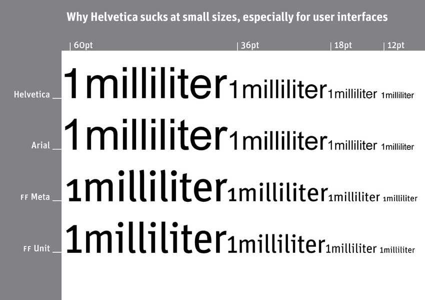
Since responsive web design will make your text smaller or bigger depending on the screen size, you should pick a font that has both great readability and legibility, at all screen sizes.
With many older fonts, that were not originally designed for the web, you’ll often experience some type of legibility or readability issue, especially at small font sizes. A classic example is Helvetica.
Helvetica is borderline illegible below 12pt (16px), and almost unreadable as a whole, because characters in certain words, such as the l’s and i’s in “milliliter” look so similar to each other that you have to pause, squint, and work hard to comprehend them:

Since there’s no such thing as a perfect typeface, you’re always making some type of trade-off. However, professional typeface designers of modern times are aware of the challenges of web typography and have this in mind when they design web fonts today.