
A type scale is a collection of carefully picked font sizes that we use to represent different text elements in order to establish a balanced and harmonious composition in our products. By consistently using the same font sizes from our own type scale, we can automatically instill uniformity in our design and avoid a product that looks all over the place in terms of hierarchy and prioritizes.

A type scale is also called a “typographic scale”.
Restriction enforces consistency
In principle, type scales work the same way that spacing scales and color palettes do. The more limited your design options are, the easier it is to enforce consistency, in terms of how your product looks and feels. Consistency is a crucial part of building trust with your audience.
A type scale is a way of restricting your freedom as a typographer or designer, in return for providing your audience with a consistent user experience.
The less new information (all visuals are information that requires processing) your audience has to digest when they’re exposed to your product, the less confusing and fatiguing it is. The last thing you want when people are visiting your website or looking at your products is to make them confused, or tired.
How to pick a type scale for your project
Whether you’re writing blog posts or designing wine labels, you’re going to work with a handful of different text elements, both in terms of font sizes, and sometimes different typefaces (font-families).
To keep things simple, let’s assume you’re working with one typeface. The main question you need to answer is how many font sizes does your project need to optimally represent its different text elements.
The following are some of the most common types of text elements:
- Title & Headings
- Paragraphs and lists (body text)
- Captions
- Subtitles
- Blockquotes/pull quotes
If you’re a writer, you’re probably using all of them regularly.
You would usually pick one font size for each of the text element types above — with headings being the exception. A professional designer will typically use anything from 1 to 6 headings depending on the nature of their project.
For most website-type projects, you’ll find yourself using a minimum of five different font sizes for your scale.
Picking your scale
So how do we build our scale? How do we find the right font sizes to represent each text element, and how do we make sure that each text element works well with its counterparts? There are two ways you can build your type scale:
- Using an existing type scale template
- Eyeballing + trial and error
- A combination of 1 and 2
To use the second option (eyeballing + trial and error), you need to be an experienced typographer.
If you’re not comfortable coming up with font sizes on your own, you can take advantage of one of the existing type scales that are already made for you e.g. from Material Design:
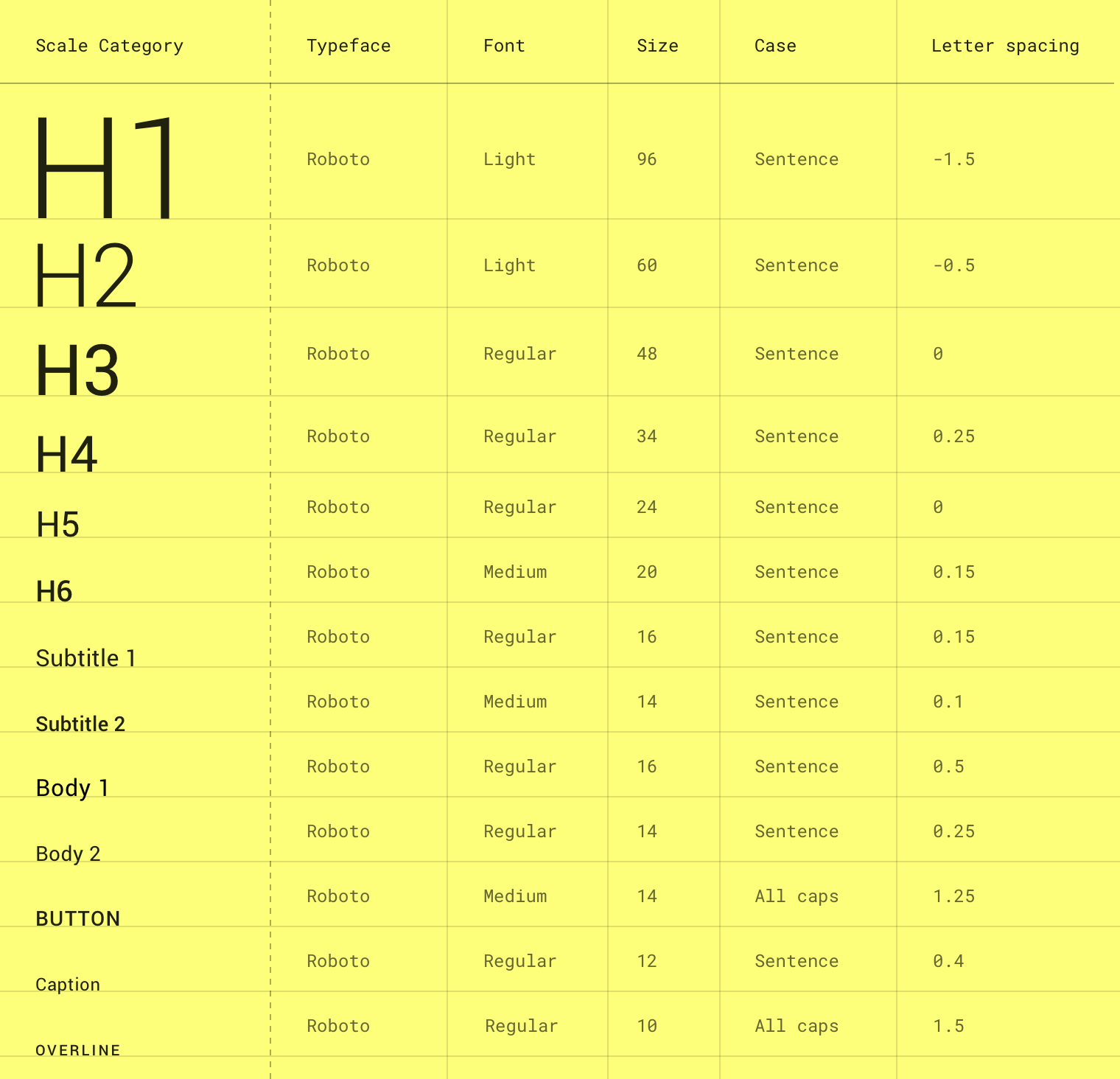
It’s a solid type scale, and for beginners, it’s always better to apply a template provided by professional designers, than just guessing your way to a result. Just be careful when using other designers’ type scales, and recognize that different typefaces require different type scales.
There’s no one size fits all in typography, so if you decide to use an existing scale, like the type scale Material Design provides, don’t use it blindly. Material Design uses the Roboto typeface, and for that, their type scale works great.
If you’re using a different font family than Roboto for your project, you can still use Material Design’s template as a starting point, but depending on your typeface’s structure, you might have to tweak a few things to make it work just right.
Use a type scale generator
You can also use a type scale generator e.g. from type-scale.com. This glorious website allows you to choose between different mathematical scales (based on real musical scales) and automatically generate a CSS stylesheet for you.
You can test hundreds of font-families (via Google Fonts) and 8 different type scale templates. You can even create your own custom scale (not for beginners).
Scroll down on the website to read the instructions on how to use the generator.
Although there is no guarantee, you’ll almost always come up with a more harmonious result by applying one of the proven type scales from type-scale.com, than if you’re just winging it.
That’s why I suggest that you combine suggestions 1 and 2 from my list earlier: pick an existing template as a starting point, such as Material Design or one of the scales from type-scale.com and then tweak it to your needs through trial and error.
The only way to become a better typographer is through experimentation, but it doesn’t hurt to use some collective knowledge to guide you on the right path.
