Readability is about how easily you can read words or a document as a whole (headings, sentences, paragraphs, quotes, etc.). This is influenced by your text formatting decisions (typography) such as structure, hierarchy, font sizes, line length, line height, margins, whitespace, and contrast.
Legibility is about how easily you can recognize, distinguish, and read individual characters in a text. This is largely determined by how the characters in a typeface are designed.
Readability is about the overall reading experience, while legibility is about recognizing characters in a typeface. If you can’t read individual characters in a font, the font is illegible, at least in that specific context.
It’s worth mentioning that a block of text can still be readable, despite having legibility issues. You don’t necessarily need to distinguish every letter in a word to understand it because your brain can fill in the blanks — unless the word in question is foreign to you. However, this is not an ideal scenario.
It’s also worth mentioning that a font can be illegible at X font size, but legible at a bigger font size. More about that later.
How readability and legibility interplay
The following is an important observation about the inverse relationship between legibility and readability, which most people don’t realize.
- A typeface can be illegible but readable at the same time.
- A typeface can be legible and unreadable at the same time.
Huh?
Well, individual characters in a font can be easy to recognize individually, but those characters might not read well in a group of letters (whole words).
A block of text can still be readable, despite having legibility issues because you don’t necessarily need to distinguish every letter in a word to understand it because your brain can fill in the blanks — unless the word in question is foreign to you.
Remember, readability is how well you can read whole words or blocks of text as a whole — legibility is about recognizing individual letters.
Font sizes play a huge role in readability and legibility.
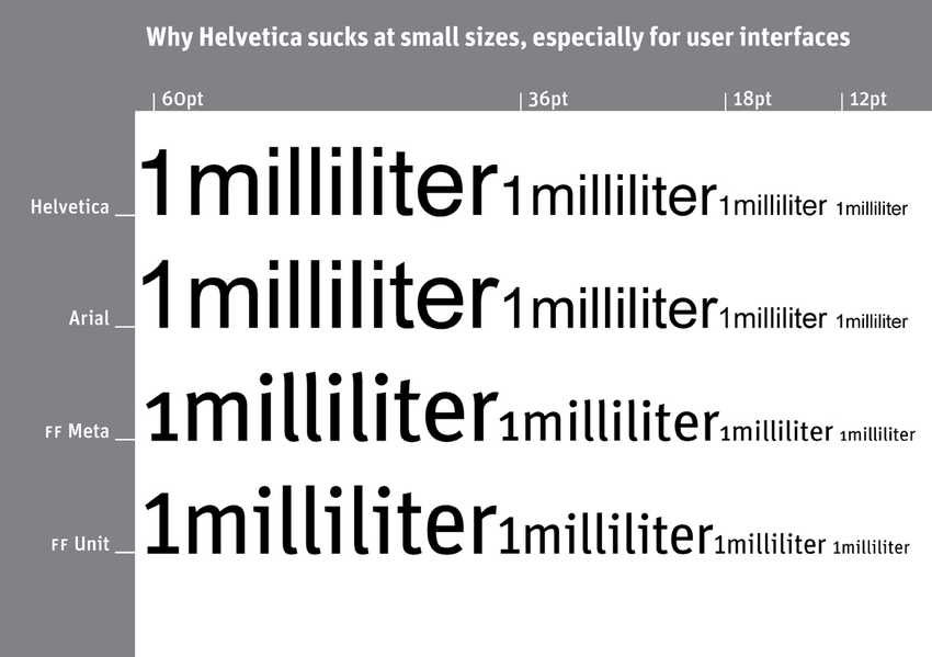
Especially sans serif fonts, are often so plain and evenly balanced in their character design, that at small font sizes it’s hard to tell the difference between i’s and l’s, or m’s and n’s because small font sizes mean fewer pixels, which results in less detail, and therefore less distinguishability.
Doesn’t that make the font illegible? No, it makes it unreadable, at small font sizes, because if you can still read the characters individually, the font is legible from a design perspective.
However, the readability is hurt because of the lack of details on the characters, at small font sizes, make them blend in certain words.
Serif typefaces often have better readability at small font sizes than sans serifs, because the extra font character details make it easier to separate characters in whole words, and thus it doesn’t cause you to pause and squint your eyes to read words.
Conversely, at bigger font sizes, sans serifs often have better readability than serif — at least when it comes to reading speed.
How so? Because at bigger font sizes you have more pixels to work with, which adds enough details on sans serifs to avoid certain characters blending — but not so much detail that it slows down reading speed.
The more pixels/details on characters the more time it takes for the brain to process information.
Because serif typefaces have extra decorations on their letters (more detail usually means more pixels) there’s more information for the brain to process, which can slow down reading speed.
In other words, the same typeface can:
- Increase reading speed and readability at bigger font sizes — compared to other typefaces
- Slow down reading speed and hurt readability at small font sizes — compared to other typefaces.
Pick fonts that are designed for the web
Since responsive web design will make your text smaller or bigger depending on the screen size, you should pick a font that has both great readability and legibility, at all screen sizes.
With many older fonts, that were not originally designed for the web, you’ll often experience some type of legibility or readability issue, especially at small font sizes. A classic example is Helvetica.
Helvetica is borderline illegible below 12pt (16px), and almost unreadable as a whole, because characters in certain words, such as the l’s and i’s in “milliliter” look so similar to each other that you have to pause, squint, and work hard to comprehend them:

Since there’s no such thing as a perfect typeface, you’re always making some type of trade-off. However, professional typeface designers of modern times are aware of the challenges of web typography and have this in mind when they design web fonts today.