Learn why you should design your forms so their input fields’ width matches the expected input length, to avoid confusing your users.
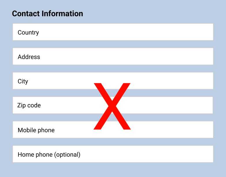
Many websites have forms with input fields that have the same width regardless of the length (width) of the content that users type into the fields. You’ll see forms with input fields e.g. for address and zip code, with the same width, even though zip codes are rarely more than 4 to 6 characters long. Input fields for zip codes don’t need nearly as much space as addresses usually do.

The same problem is often seen with credit card forms where the input field for the security code is way longer than necessary (credit card verification/security codes are usually 3 digits long):

Why is this such a big problem? I mean, after all, it’s not like the extra space we use costs us anything, right?
Oh, but it does cost you because it confuses many of your users, which hurts your form’s usability as this Baymard institute usability study discovered.
Design expectations
When people fill out forms, they have a built-in expectation that the UI will guide them to make the right decisions. If you fill out a long input field, with just 4 or 5 characters, some users will assume that they‘re doing something wrong, because the form doesn’t match their expectations. You wouldn’t grab the biggest cup from your cupboard if you’re making a small cup of coffee, would you?
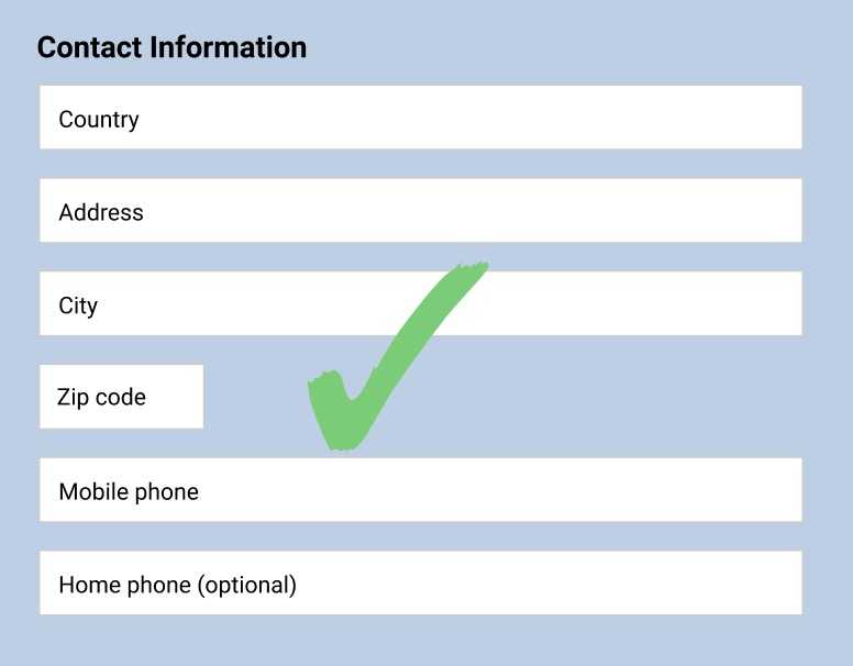
The solution is simple:

A short input field tells your user that they’re expected to type a short amount of characters — which matches the short nature of zip codes, security codes, etc.
I know what you’re thinking, the example above has several input fields, e.g. for country and phones that are way longer than necessary, so why not make them shorter to more closely match the length of a country name, phone number, etc.?
Well, some country names are really long such as:
- The United Kingdom of Great Britain and Northern Ireland
- Independent and Sovereign Republic of Kiribati
- The Democratic People's Republic of Korea
And some phone numbers are up to 15 digits.
While those examples above are atypical compared to the average, we’re designing forms for all users — not just the average. In forms, it’s usually better to have too much room rather than too little.
A part of designing for expectations is also to consider that people use best what they use most. In other words, most website forms have input fields for address and phone that are a good bit longer than they need to be fit the length of most country names, addresses, and phone numbers. People are used to seeing that.
However, when it comes to filling out more uncommon or technical data, such as credit card verification or security codes, most modern websites have input fields that match the length of the expected input. Therefore, if a user suddenly sees a label for CVC (Card Verification Code) with an input field that is way longer than what they’re used to, they start wondering if they misunderstand the field label because the width of the field indicates that it expects a long number.
Function over form — but...
Function (how does it work) should always be prioritized over form (aesthetics). With that said, even if we could adjust the lengths of some of the input fields in a common form, to closer match the typical length of the expected input, we also have to consider the aesthetic element of design. Part of great design is using consistency, whenever possible. Humans are drawn towards consistency, and a consistent UI is easier to digest than an inconsistent one.
So if you have a big form with 10 input fields, you don’t want to have 7 different input field lengths, because it makes your form look messy (inconsistent).
Design your forms based on function and context first and foremost, but don’t forget the importance of an objectively good looking design that follows the principles of symmetry, proportion — and again, consistency.