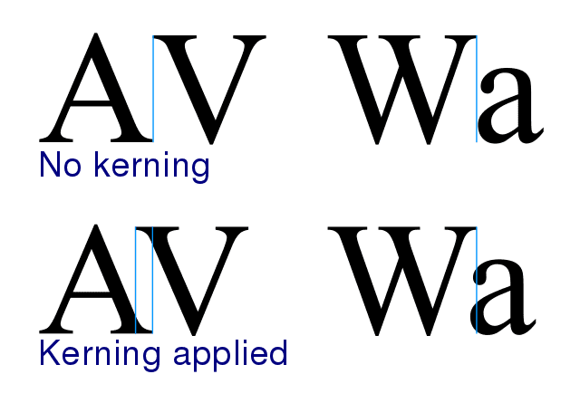
Kerning is the process of adjusting space between specific letter pairs to improve legibility in words that have inconsistent spacing, which makes the text look awkward and unprofessional.

Professional fonts have 100s, sometimes 1000s of kerning pairs provided by the typeface designer. The more meticulous the designer is, the less chance you’ll experience kerning issues, caused by the font — but external factors can still cause kerning problems).
Kerning issues sometimes occur in graphics applications that use auto-kerning (Metric or Optimal kerning). Auto-kerning can override the built-in kerning data from the typeface designer by applying generic computer-generated kerning that doesn’t fit the particular font.
Tip: turn off auto-kerning in your software (if you can) when you work with professional fonts. The fonts should already come with proper kerning built-in, provided by the typeface designer.
Let’s say you have some text with bad default kerning. If you add or remove letter-spacing from that word, the relative kerning problem will remain, but now all letters in that word will just have more or less overall spacing — the kerning issue is the same.
With kerning, you pick out the guilty letter pairs in words and fix their spacing issues so that they align with the rest of the letters in that word.
Kerning requires more experience and focus to get it right. The best-case scenario is that you’re working with a font and a graphics program that doesn’t require kerning.
How to turn on kerning with CSS
If your web font of choice includes kerning data, your browser will automatically determine if font-kerning should be applied to your text. It does this by using the font-kerning CSS property, which is set to auto by default:
font-kerning: auto;In other words, a browser may decide to apply kern to your font even if it has kerning data built-in (for whatever reason).
If you want to make sure that font-kerning is applied (if your font has it), regardless of the browsers “opinion”, then swap auto out with normal:
font-kerning: normal;If you want to turn off kerning, use none as a value:
font-kerning: none;Wait, why would you turn off kerning on a web font that has kerning available?
Well, perhaps you discover that your font-kerning renders wrong in X browser, e.g. due to a temporary browser bug. In that case, it’s nice to have the option of turning it off.
Another thing that sometimes occurs is that one-off text elements behave oddly in a specific situation, and in that case, it’s convenient that you can turn it off, e.g. with a CSS utility class:
.kerning-none {
  font-kerning: none;
}
How to tell if your web font has kerning data
A quick way to find out if your web font has kerning data or not is to disable and enable it back and forth, by setting it to none and normal and closely watch for text-rendering changes in your browser: