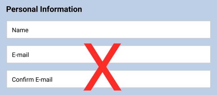
A common UI form design pattern is to add an extra input field for your users’ email address, to confirm that their email is typed correctly.
In reality, having an extra email field does not guarantee that users will type a valid email address. Users will often copy and paste their email addresses from the first email address field into the second. So if the first field is typed wrong, the second field will be wrong as well.
This is redundant:

This is better:

But wait, not all users will do the copy-paste thing, and besides, isn’t the point of having a confirmation field to have the form compare the two fields and let the user know if they typed two different email addresses, by displaying an error message?
Yes, but ask yourself this question:
How likely is it that a user types the wrong email address on their first attempt, if:
- Your form design displays clear input fields with big enough text that even visually impaired people can read it (as any form should be)?
- And does your user truly care about signing up for your newsletter/platform?
Consider your website’s form as not just a tool to collect as many email addresses as possible, but also as a way to filter out people who don’t really care, but just sign up because “hey why not, it’s easy!”.
Quality over quantity.
Not convinced yet?
Fortunately, there are other things you can do. After the user has input their email address, as the user continues to fill out the rest of your sign up form, you can run a check in the background that looks up their inputted email address to confirm that it’s valid, and then display an error message, in real-time, if it’s not.
You could also run this email validity check upon form submission by displaying a message that says:
Just a second as we confirm your information!
And then let your user know if their email was invalid.
If it goes through, you can display a confirmation message like:
Thank you, you’ll receive a confirmation email at johndoe@gmail.com shortly.
Now your users get their sign-up/subscription confirmed in real-time.
By designing a sign-up user experience like this, you let your users know that you’re not just another email collector, but that you care about every subscriber’s experience.
But what if your user did type the wrong email address, but it’s a valid (existing) email address out in the wild, that belongs to someone else?
Well then someone is going to get an unexpected email!
Joking aside, that’s why you display the exact email they used to sign up inside the sign up confirmation message, highlighted, just like the example I showed above.
At the very least your user will either spot their typo right away and realize they need to sign up again or find out when they check their email and realize they haven’t gotten a confirmation mail in their inbox.
Again, if they truly care, they’ll spend another minute to sign up again (this time in a more focused state).
Here’s another thing you can do at the very last step before your users click the submit button on your form:
Are you sure all your information is correct?
Any user who gives a crap will react on such a message if they have just the slightest doubt that everything they filled out is correct.
Again, if they don’t care to quickly scan through the form that they just filled out, before hitting submit, and it later turns out that their email was wrong, do you really think signing up to your platform meant much to them?
And on a similar notion, do you want those types of users (who don’t care) to sign up for your platform and services?
“Come on, why not just add that extra email field, it’s not like it costs you anything!?”
Oh, but it does. Any redundant step is a step in the wrong direction.
Any additional step to complete an action, in any area of life is an obstacle, even if it’s seemingly small. More steps cause more friction. Every time it takes your users one more step to complete an action you reduce your average user sign up completion rate.
Every step takes time. A form with 10 fields is way more overwhelming and takes more time to complete than a form with 5 fields. If you can get away with 5 fields, in your specific use case, then use 5 fields. People are busier and more distracted than ever, don’t add more clutter to their life than necessary.